
MEDTRONIC
Role: UX/UI Design & Content Strategy
Duration: Two Weeks
Audience: Type 1 Diabetics
Tools: Figma & Freeform
Introduction
Over 300,000 Canadians, including myself, live with type 1 diabetes. Effective management is crucial to prevent serious long-term complications like blindness, nerve damage, and more. An extensive list of tools exist to help with glucose control, in my experience, the MiniMed Mobile app is at the very bottom of that list. Frequent crashes, accessibility issues with data visualization, paired with limited functionality, create significant challenges.
In this case study, I redesigned the app, creating a more meaningful and user-friendly experience for individuals with diabetes. Check it out below 👇


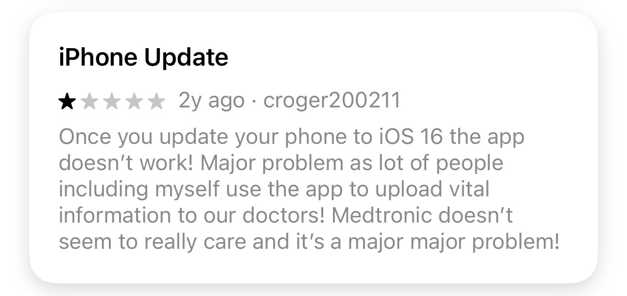
What do People say about Medtronic?
Nothing great… the app’s got a 2/5 star rating on the App Store 😵💫


I read reviews, got lost in Reddit rabbit holes, spoke to friends, and interviewed my diabetes team of doctors, nurses, and dietitians at St. Mike’s Hospital. Here are the learnings that stuck out 👉


Key Findings
-
Users want a discreet and convenient way to give themselves insulin straight from the application, removing the need to take out and consult their insulin pump.
-
Users desire visual improvements to the app to enhance usability and enjoyment, emphasizing that these changes don't need to be radical, but should improve the overall aesthetic.
-
Text is too small, icons are confusing, and the graphs… don’t get me started on the graphs (this one’s personal). Deciphering hieroglyphics might be an easier job.
What’s gotta Change?
These screens represent the app’s current state, as you can see it’s pretty bare bones. It has the information users need, like glucose levels, stats, and the user’s insulin pump status. Nothing more, nothing less.

Home Screen
While the prominent glucose level display and trend indicator exist, the graph's four overlaid data sets create a confusing experience.

Time In Range Screen
Good, I can see stats to gauge the quality of my glucose within the last 24h, but users need more information to make calculated decisions.

Status & Settings Screen
It’s great that I can see how much insulin and battery I have left in my insulin pump, but there has to be a better way to display this information.
Persona & Journey Map
As I define the problem further, you can consider Jessie as the manifestation of my research, highlighting specific goals and pain points.


Here’s a link to Figjam if you want to zoom in for a better view
Problem Statement
“How can the MiniMed app be transformed into an essential resource for Type 1 diabetics through significant improvements in functionality, accessibility, and design?”
Intended outcomes
Overhaul the UI with a new color scheme, fonts, and micro-interactions to make the app enjoyable to use
Show what new functionality could look like if users could deliver insulin directly from the app
Improve accessibility and the overall clarity of the app so users can access their data to find patterns and make informed decisions about their health quickly
How it COuld Look
I dabbled with Dribbble and perused Pinterest to pinpoint a suitable art style. My focus: healthcare interfaces that prioritize clear, accessible information. A grid-based layout, reminiscent of a bento box with its distinct line and shape divisions, stood out as a compelling organizational structure. Finally, a quick mind map solidified the screen and content requirements, transforming scattered ideas into a focused design plan.

How It Looks!
Mid-Fidelity Screens

High-Fidelity
I’m going to try and bring this back full circle for a second, let’s think about the problem statement and pain points users expressed online to create a short story (@hiringmanager, please humour me for a sec) using Jessie as an example 👉
-
Jessie’s at a wedding wearing a button-up shirt tucked into his pants. A notification tells him his sugar is rising, and he needs to give himself insulin. He can’t take out his insulin pump because it’s tucked under his shirt, so he needs to go somewhere private to undo his pants and untuck his shirt to get to his pump. He opens the current MiniMed app to check how much insulin he needs based on his sugar and carb intake. Keep in mind it’s a wedding, he might be a little tipsy, and looking at the current graph, each stacked on top of each other, makes him dizzy. He’s no amateur though, but he ain’t happy. He takes a few minutes to see where his sugar is trending and gives himself the correct dose of insulin. FIN.
-
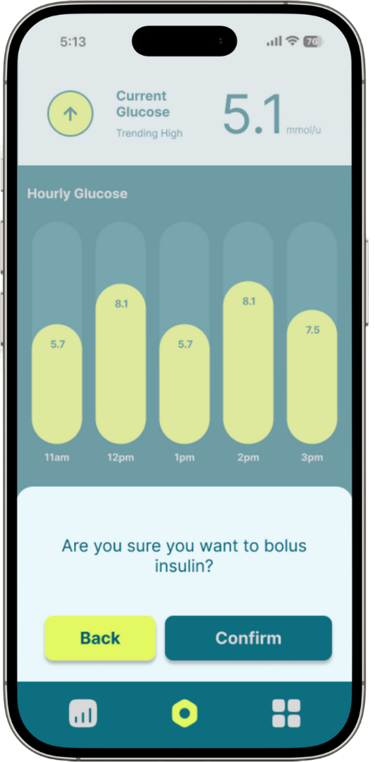
Jessie’s at a wedding (tipsy) and his pump is hard to get to without a “wardrobe change” while his sugar rises. He takes a step off the dance floor and whips out the MiniMed mobile app to scan only the specific chart he needs to understand how much insulin is required. He navigates to the bolus screen and boom, job done.
Now you might ask, “How was it so much easier the second time around?”. The answer is based on two main things:
User Flow: The new app uses a primary chart as well as a bento grid that users can swipe through quickly. This simplifies the graphs and makes it easy to decipher at a glance. This is especially important when users need information quickly, along with users who may have limited vision.
Functionality: I’m aware the app may not have this functionality currently due to regulatory reasons, however I wanted to design a bolus function the way I thought most users would find helpful. This means easy access, proactive recommendations, and a clear separation of information through the app’s structure and colour coding, making it a breeze to use digitally and physically.
Moving to mid-fidelity, I redesigned the existing charts, empowering users to grasp trends and make informed decisions by removing overly complicated elements that served no purpose. Additionally, I broke each chart into individual screens for quicker comprehension.
Most importantly, I integrated an insulin bolus function so users don’t have to leave the app. This includes a smart dose recommendation, factoring in current glucose and carbohydrate intake, alongside a custom entry option.
These decisions were made to remedy specific pain points, such as the need for easy access to information and the ability to bolus insulin directly from the app.
Get In Touch!
Do you have any questions, a product idea, want to discuss a project, or need a designer?
Drop me a line 📲